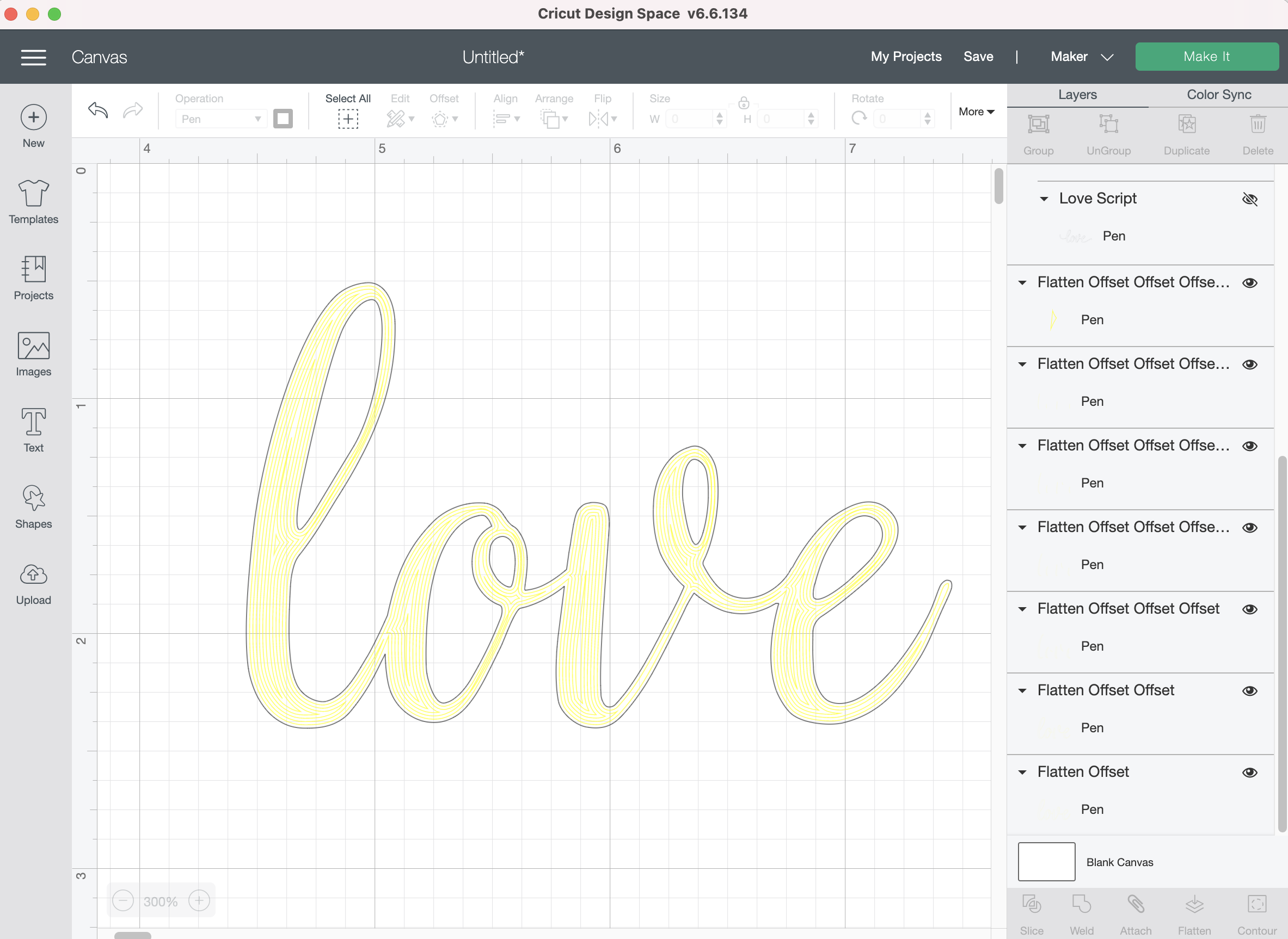
The offset feature in Cricut Design Space finally offers a way to fill in letters directly in Design Space. Although, this is far from my favorite method for filling in letters, it’s another useful technique to have in your arsenal.
Cricut Design Space - Filled Letters using Offset method
This took a bit of trial and error to get an end result I was satisfied with, nothing is ever as simple as it seems with Cricut Design Space, LOL!
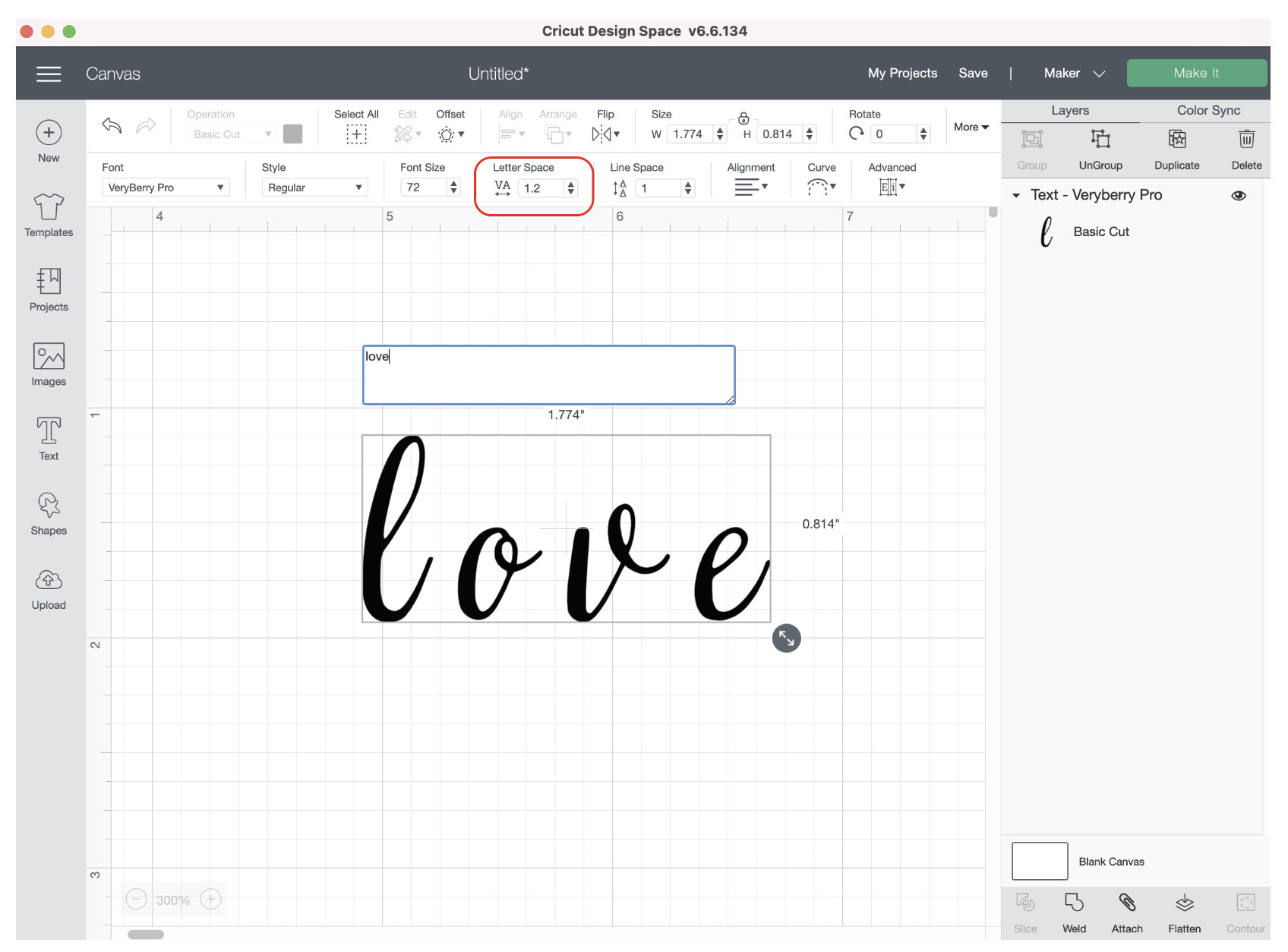
I typed the word “love” first. I’m using one of my system fonts - Very Berry. Of course the letter spacing (kerning) is absurd, so I have to adjust that first.
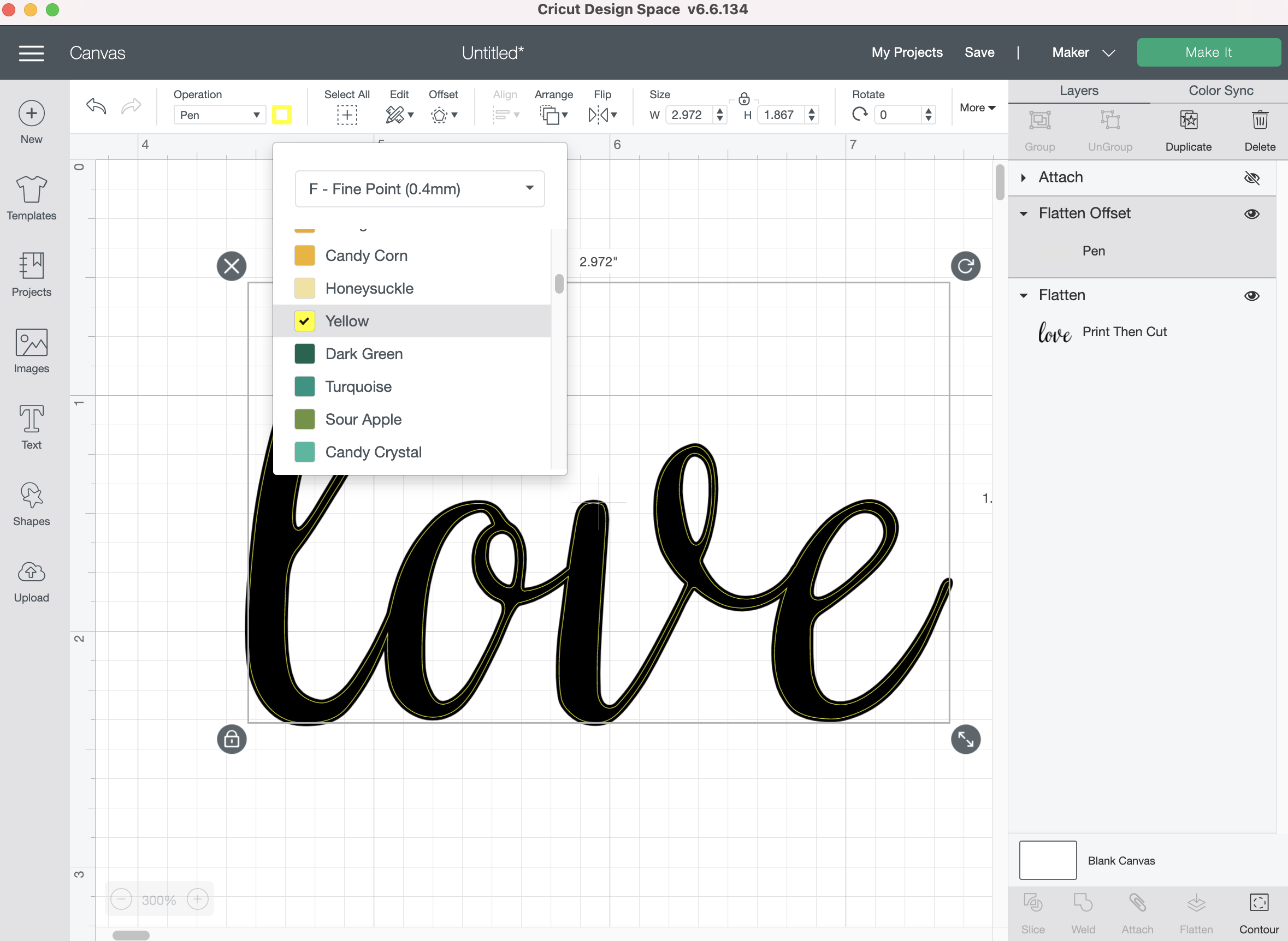
Then in order to get the offset to behave how I want, I need to “flatten” my text layer so it becomes a “Print then Cut” layer.
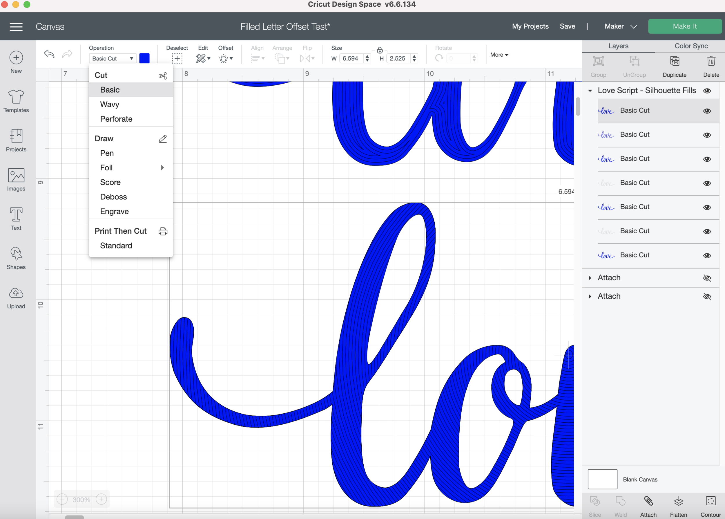
Then, with my flattened layer selected, I click on the offset button in the top tool bar. I type in -0.014 inches, that’s basically equivalent to a 1pt offset in Illustrator, which is how close I like to keep my lines if I’m going for a solid filled text. Note: You have to type -0.014 in the box, it’s such a small measurement you cannot use the slider.
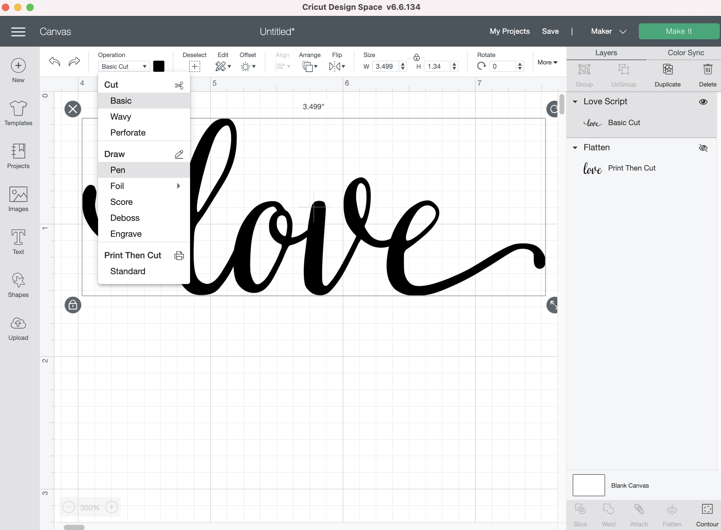
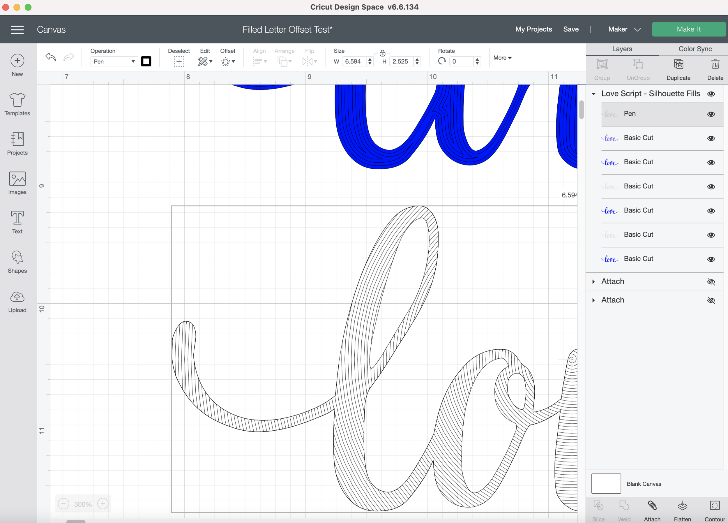
Next, so I can actually see my offset lines, I change my offset layer to a “Draw” operation and change the line color to something bright and contrasting against the flattened black layer.
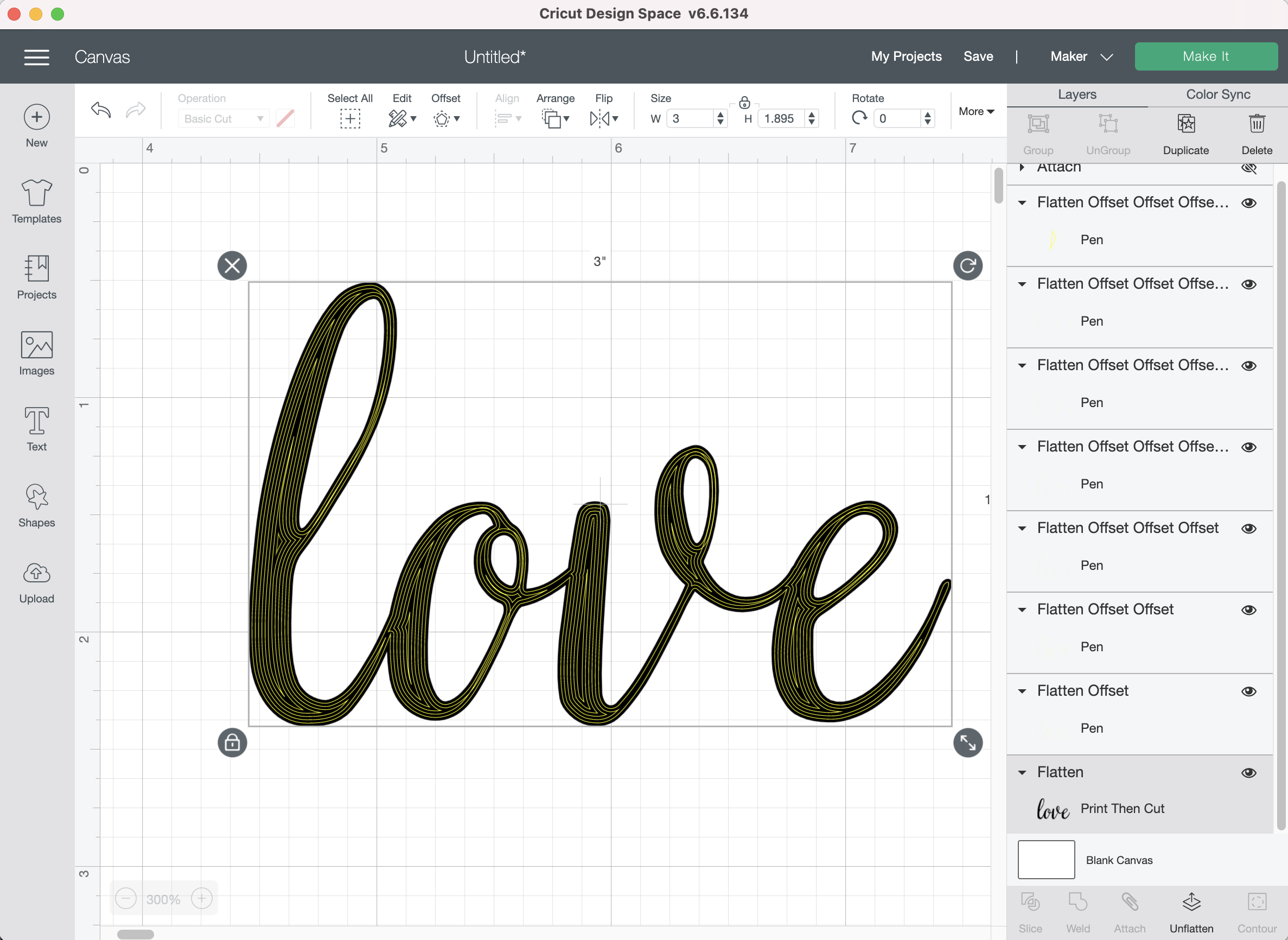
I select the offset layer I just created and then click the offset button again. It’s already set to the -0.014 inches, so I click apply. I change my line color again so I can see it against the flattened black layer.
I keep repeating the same offset until I get my letters filled as much as I can.
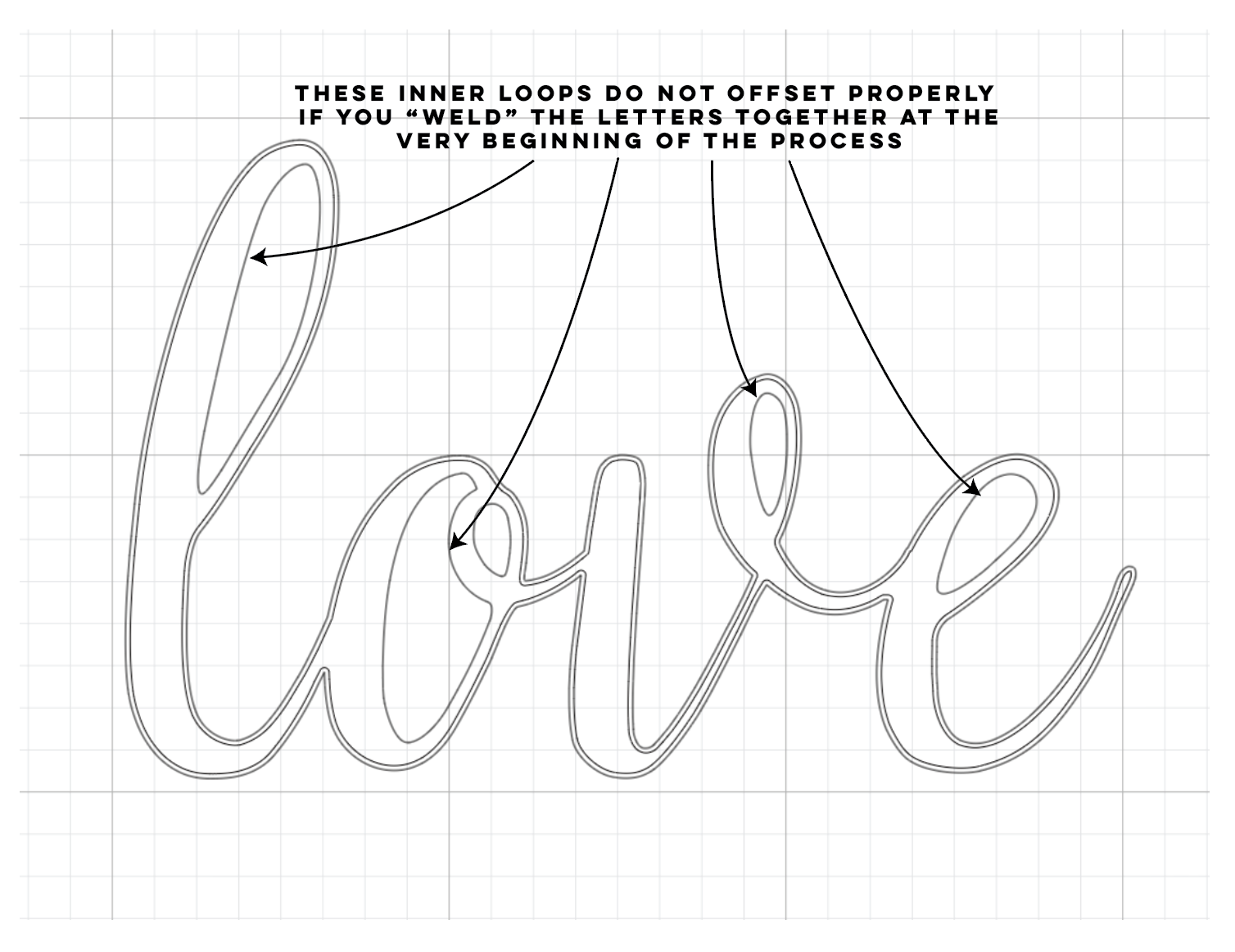
Once it’s all filled in with the offset lines, I select my original Flattened layer and “Unflatten” it. Then I “weld” the letters together.
Note: You CANNOT weld the letters together at the very beginning, the inner loops of the letters will not be offset properly.
I also tried the process with an SVG file that I imported from Illustrator. I prefer creating my words in Illustrator first, it’s much easier to adjust the kerning and use any special glyphs.
I upload my SVG as usual and change my Linetype from “Basic Cut” a “Draw” linetype.
Then I applied the -0.014 inch offset to the offset over and over again until my word was filled as much as possible.
After I show you the Silhouette Studio method we will test all the different fills on my Cricut Maker Machine.
Silhouette Studio - Filled Letters
Silhouette Studio has an awesome Line Effects tool that you can use to fill words.
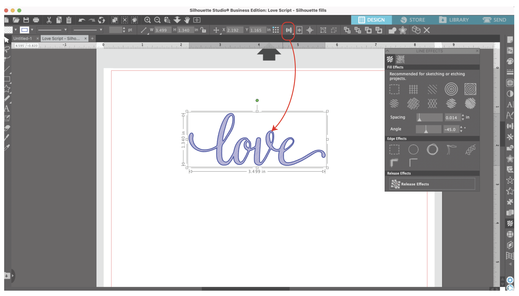
I open my same SVG file that I created in Illustrator and click on the Line Effects tool on the right tool bar.
I’m going to copy and paste my word so I can use one to draw an outline completely around the word, I think that gives it a cleaner look.
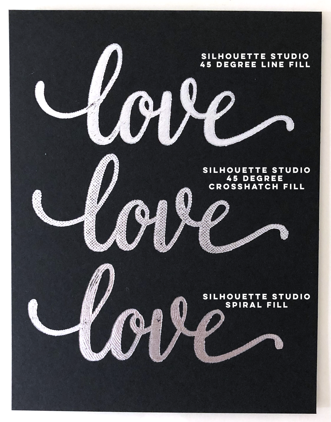
There are a few different line types you can use for fills. The first one I’m going to pick is the just the straight lines. It’s simple and it’s one of my favorites.
It starts off looking horizontal and pretty spaced out.
I type my 0.014 inches in the spacing box and -45 degrees in the angle to get the close diagonal lines I’m going for.
I use the Align tool in the toolbar across the top to line up my fill lines with the outline.
Next, I duplicate both layers and then I pick the crosshatch fill. I’m going to keep my spacing at 0.014 inches and a -45 degree angle.
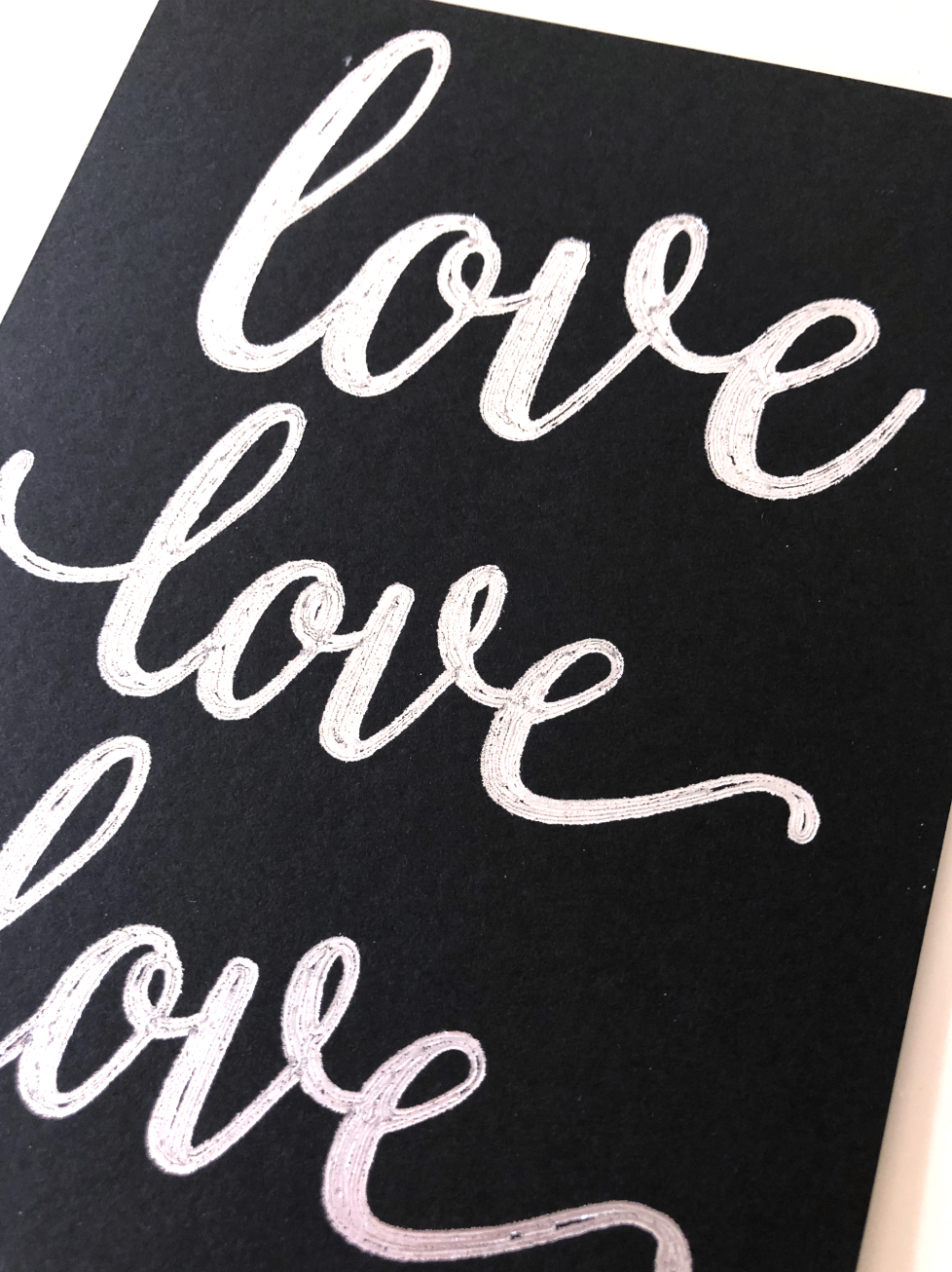
I duplicate my words again and I pick the concentric circles, this gives the same look as the offset in Cricut Design Space. I keep my spacing at 0.014 inches.
The last one I’m going to try is the spiral. It already has an outline so I can delete one of my layers. I keep my spacing at 0.014 inches and my angle at -45 degrees.
Since I have the Business editon of Silhouette Studio, I can save my file as an SVG so I can import it into Cricut Design Space.
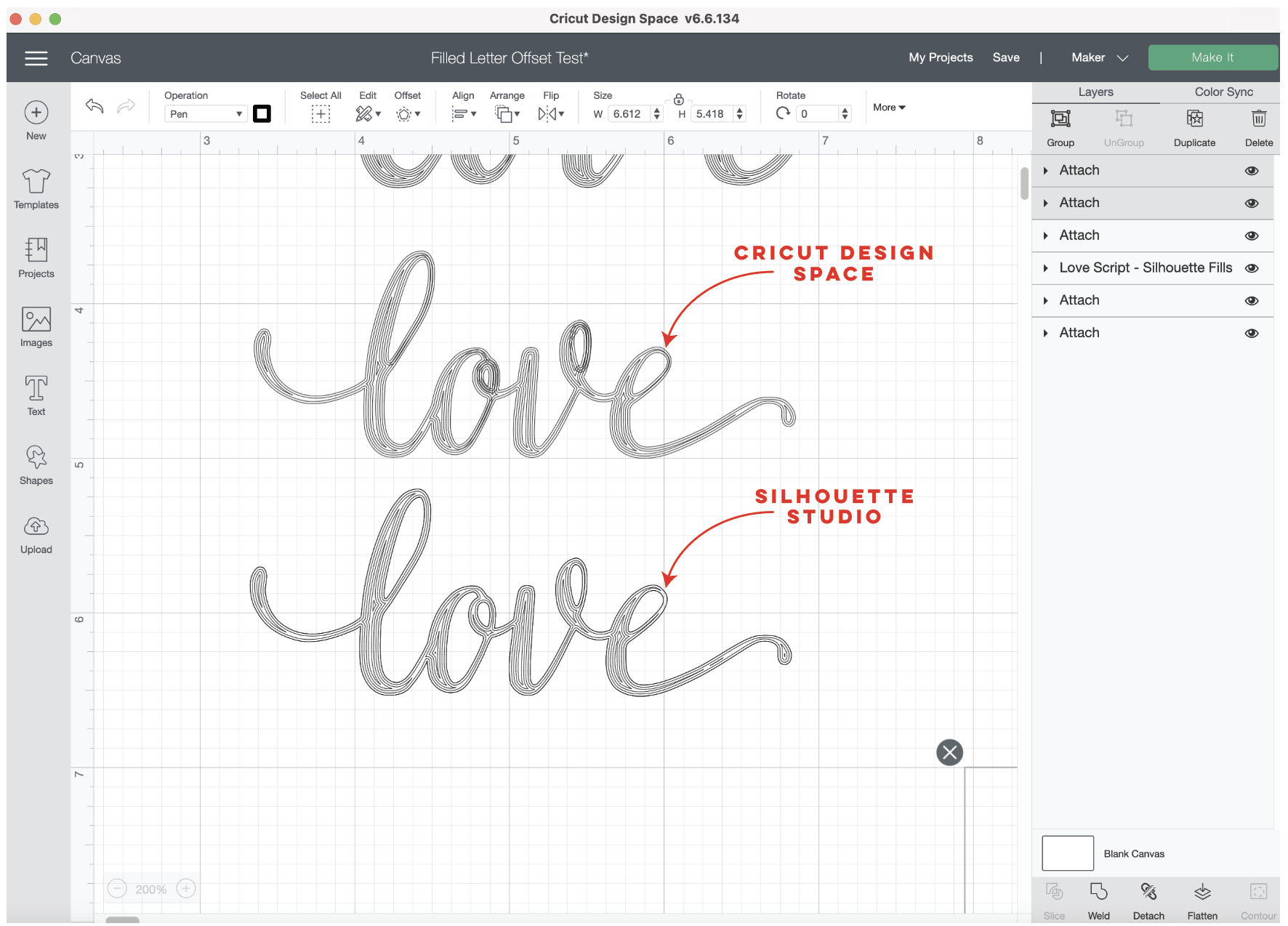
I’m open my SVG in Cricut Design Space. I need to change the linetype to “Draw.” For some reason my SVG is twice the size it was in Silhouette Studio, so I’m going to scale it back down to size.
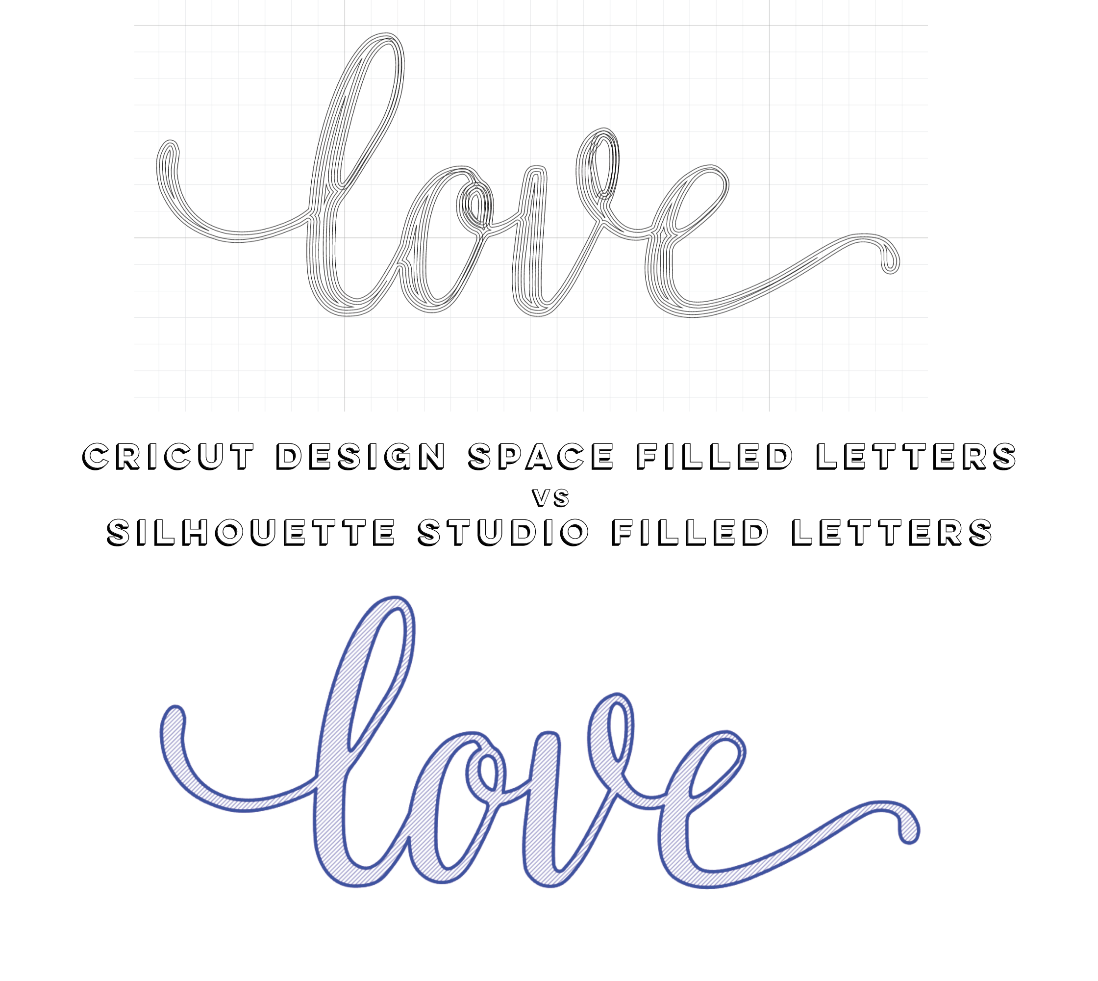
Here’s a comparison of the offset from Design Space and the Concentric circle fill in Silhouette Studio.
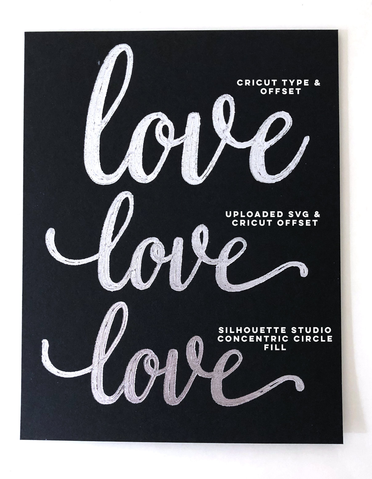
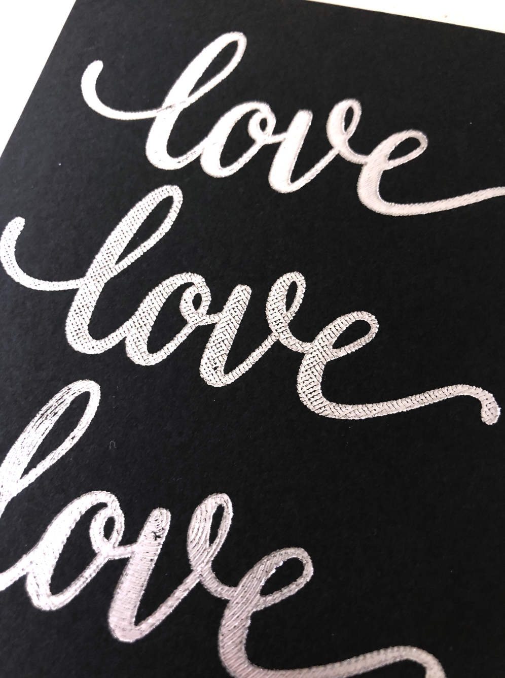
Time to test the different fills! I’m going to use my We R Memory Keepers foil quill, medium tip on cardstock with my Cricut Maker.
Here are the different results, my favorite is still the diagonal line fill at 45 degrees. The crosshatch and spirals both have some interesting textures. The offset is still not my favorite, the lines start to create weird little areas at some of the intersections.
Which fill style is your favorite?

